
Set of Boxed Cards - His & Her (AECP Level 1 Final Assignment)
- Ruby 2 Shoes
- Jul 5, 2022
- 19 min read
Updated: Aug 9, 2022
Before I begin, please know this is a very long post as I'm sharing 12 cards for the AECP Level 1 Assignment.


Wow! I hadn't realised it had been this long since I posted. The truth is life over the past year has been incredibly challenging, and while I've made the odd card here and there, my poor creativity took a dive.
I am now back in full swing and hoping that life will be a lot easier going forward. I have to be honest though, taking a break from blogging didn't stop me from buying lots of new things haha. I watched a great video over on Coloring Bliss about ASSA - Art Supply Separation Anxiety. Jennifer did a video about not being too far away from your art supplies and yep, it's real for me haha.
So, onto today's cards, all 12 of them. You don't hear from me for ages, and then I share loads!
If you've been following my blog, then you'll know that I've been doing the Altenew Educator Certification Program. Thankfully, you can go at your own pace. The programme is made up of 3 levels with levels 1 and 2 being where you watch lots of training videos on specific techniques, and then level 3 where you deliver a training workshop. (I am totally simplifying this here. Check out the educator page to find out more). NB: You can just purchase the videos, you don't have to do the Educator Program if it's not for you.

For level 1, you have 10 training techniques, ranging from die-cutting, ink blending and stencilling to things like seasonal cards, clean and simple, and my personal favourite, 'For the guys'. There are instructional videos for each technique and then you make cards based on what you've learned.
The Final Assignment
For the final assignment, you have to create a His and Her card gift set, with 4-6 cards in each set, and create packaging using something recycled. Now, for me, feminine cards are not so hard to make. Masculine cards usually present a challenge. However, since doing the For the Guys masterclass, I now find it so much easier. It was a game-changer for me when thinking about making cards for guys. If you have trouble with them too, check out the masterclasses, it's well worth it. I learned so much from them.
The challenge is also to select ANY 3 components from the classes in Level 1 (e.g. Layering 1/2, Let it Shine, Stencil Techniques) for each card. It sounds quite easy but it takes a lot to get your head around. It did for me anyway!
HER CARDS
Here's how I started. I went through the list of videos and techniques to choose which 3 components I wanted to use. For the gals cards, I chose the following videos: Easy Die Cutting Techniques, Easy Ink Blending Techniques and Let it Shine. I'll come onto the guy cards later.


I then drew out some simple sketches to work from and listed each of the 3 elements I would include so that I made sure I left nothing out.
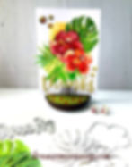
I chose one of my favourite die sets for the main theme, Altenew's Hibiscus Garden 3D Die set. It's so gorgeous!

I die-cut loads of flowers and leaves in watercolour paper, and then painted them using my Altenew Watercolour Brush Markers Tropical Fiesta Set. I would not have even thought of watercolouring die-cuts if it hadn't been for this video by Erum Tasneem. In fact, it was this video that made me 'need' this die set in the first place!
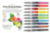
The colours are so vibrant in this Tropical Fiesta Set and the perfect colours for this project. I knew I wanted to use a varied colour palette so chose purples, reds, oranges and yellows, with different shades of green for pops of contrast.
If you like using colour palettes too, check out Coolors. There is an app for your phone and a desktop version too. For this set of cards, I already had my colour theme in mind, but you'll see later that I used Coolors for my male cards and I've shared the colour palette I ended up with.
Card 1 - Happy Birthday

For my first card, I started by die-cutting a rectangular stitched panel, which I then ink blended with Altenew's Sunray, Chamomile and Coral Berry ink pads.
Tip: Use two different colour themes and blend one into the other to create more interest.
Using an embossing mat, I then ran the panel through my Big Shot machine with Altenew's Dodec Die to create a partially embossed die-cut. If you look closely at the picture below, you will see the embossed background only fills 3/4 of the panel. I've always been intrigued by this technique, but never really done it. I've not done embossing with dies before. If I'd have known how easy it was, I'd have used it years ago!

Tip: Try partial die-cutting/embossing - Put the cutting plates with the card and die sandwiched in between them (and the embossing mat if you want to emboss and not die-cut) and align the plates up so that they don't cover the complete panel. The machine will only cut/emboss what is sandwiched under the plates. So simple, yet really effective.
To finish the base panel, I had a go at foiling. I don't have a foiling machine yet (It's on my birthday wish list), so I went with Clarissa Wiley's technique of marking out lots of little glue spots on my panel and then pressing a piece of silver Decofoil to create the little silver dots. You allow the glue a moment to transfer the foil to the card before removing it. I loved playing with the foil, it's so easy to use and takes your cards to a new level.

Tip: Think about where you want your placement of foiling to be. I had to go back over mine because when I put my leaf over the top, it didn't quite work where a lot of the spots were covered over. It's an easy fix though, just add extra glue spots and refoil.

To finish this card, I die cut the Altenew's It's Just a Number die in white, with the shadow die in black, and then attached both flowers to the card, one directly to the card and the other with pop dots.
I then placed everything onto a white card base.
Card 2 - Thinking of You
For my next card, I created a simple faux watercolour background.

Using Altenew's Coral Berry and Rouge mini ink cubes, I did a watercolour wash on some watercolour cardstock. I find 'random' quite a challenge, and with watercolour, there is no real control, you just have to go with where the colour takes you.
Tip: Use a nice thick watercolour card, it can cope with a few layers of water that way.
To keep it more random, I used a technique I learned from Kristina Werner way back in the day, where you use a piece of acetate to lay your colour down. All you do is turn your ink cube over and twist it onto your mat so that you get a bit of colour down, and then you add some water to turn it into a liquid that you can then 'paint' with. Another way I like to do this is to apply some ink onto an acrylic block, it just depends on how big an area I'm working with.
Once you have the liquid, you take a small square of acetate, pick up the colour and then use that to apply it to the paper, smooshing the paint around your background. The beauty of it is that you can see through the acetate so you have an idea of where you need to apply more colour.
Once I was happy with round one of the wash, I hit it with my heat gun to dry that layer. I then went back in again with the remainder of the colour on the acetate. This remaining wash adds in the tiny details over the top. It's great for little splats and marks to make it look artsier.
Tip: To add even more detail, try adding splats with a paintbrush after you've done the wash.
For the wording, I did the same process but instead of a wash, I used the inks to create a darker coloured cardstock with a bit of fading at the top and then die-cut this using Altenew's Thinking of You word die.

Tip: Use your inks to create your own coloured cardstock to match the rest of your card.
Once the watercolour washed panel was dry, I used the same die to cut out the 'thinking of you' word, so I could place the darker die cut into it creating a die-cut inlay. It also means I have a nice watercolour-washed word die cut for another card at a later date.
Using two rectangular dies, I then created a frame in a shimmer cardstock for my panel to sit behind. I added the flower and leaves and finished the card off by using my Wink of Stellar pen to add shimmer to the wording. Using the ink cubes to watercolour is a fabulous way to create lots of beautiful backgrounds. I'd highly recommend you add this watercolour technique to your toolkit.

Tip: If you don't have frame dies, put two rectangle dies (or other shapes) together leaving a gap between the two to create your own frame.
Card 3 - Thanks
For card number three, I stuck with basic die cutting with my previously watercoloured flowers, against a backdrop using a spotlight stencil method. Not sure that's what you really call it, that's just my made-up name.
I simply drew a fluid-type shape on a piece of white printer paper and then cut the shape out by folding the paper in four. I then cut a little slit to allow me to cut out the random shape. Once I was done, I taped the top slit with some masking tape to hold it shut.

I started by using the mask to create a pale yellow background directly onto the card base. I did some basic ink blending with Altenew's Sunray ink. Next, using the Altenew Trellis stencil I stencilled a stronger yellow, Altenew's Chamomile ink, over the top of the solid shape, using the same stencil to create a two-tone effect.
Tip: Create fun shapes by drawing out random shapes, and then stencil through them.

I layered up the watercolour flowers over various leaves, and for the Let it Shine elements, I die cut the gorgeous curly Script Words 2 Die set 'Thanks' in a gorgeous glitter cardstock, and added a few sequins to complete the card.
Isn't that watercolour effect on the flowers stunning?
Card 4 - Miss You
For this card, I wanted to create a die-cut inlay and add some simple ink blending.

I started by doing the inking, that way I wouldn't ruin the card by picking up any colour from my work surfaces.

I created a simple mask using a piece of A4 paper to cover all but one edge of my card. Using Altenew's Sunray, Chamomile, Snapdragon and Marigold inks, I created an ombre effect down the left side. I then die-cut two gold skinny strips from mirror gold cardstock to add some gold detail.
Next, I die-cut a small rectangular panel out of white cardstock. Then I laid out my flower and leaf die-cuts for placement, putting the two dies over the top of them both so I would know what to cut out. I added simple pencil marks to make sure they were in the right position.
Removing the flower and leaf die-cuts I then ran the panel through my Big Shot machine, being very careful not to move the dies, and ended up with a white die-cut panel that would then show the flower and leaves peeking through.

I stuck the leaves and flowers down and then added pop dots to the panel to give it some dimension. I added the orange flower to bring the yellow/orange in to match the side strip. The sentiment was stamped in magenta using the 'miss you' stamp from the Altenew Wallpaper Art stamp set.
Tip: If a card doesn't look quite right, see if there is another tiny detail you can add to pull the design together.
Card 5 - Hello Gorgeous
For this card, I die cut a rectangular panel in white and combined ink blending with a die as a stencil.

I die cut the Dodec Cover Die using some white cardstock and then used that as the 'stencil' for the card base. I continued the theme of gradients of colour.

I really love the final effect, and what's great is you end up with a second colourful panel that you can use for another card. It's always good to get a two-for-one card :)
For the 'shine' element I added some Kuretai metallic watercolour splats in silver.

Tip: A great method for adding splats of colour is to pop a small amount of paint on an acrylic block, and using a small paintbrush, flick the colour off the edge.
Once the base was done, I adhered it to the card, and added the flowers and leaves, some with pop dots to create interest.
I used silver gems to ground the sentiment that I stamped in Altenew's Magenta ink using 'hello gorgeous' from the Altenew Spring Daisy stamp set, and added pop dots for dimension.

Tip: If a sentiment doesn't quite look right, 'ground' it using some embellishments.
Card 6 - Celebrate
I started by cutting a panel of yellow cardstock for the card base. Using the 'embossing mat with a die' technique and my Spring Flowers Die, I embossed the panel. It looks different to my previous card using this technique where the other card base was inked beforehand.


To create a different look with the same method, I inked the cardstock afterwards, keeping as much of the yellow cardstock showing as possible, just adding a small bit of Altenew's Snapdragon and Marigold inks at the bottom. I then created a 'window' using a circle die, so that I could create a simple bokeh background with ink blending.
For the bokeh, I ink blended the background with Altenew's Sunray ink to create a soft base and then added the darker yellow dots using Chamomile ink.
I didn't have many ink tools to do the circles so I used small circular dies for most of the dots and then a little blending tool for the smaller circle. I've been known to use baby cotton buds for blending before too.

Tip: If you don't have the tools you think you need, get creative. Look around your home and ask yourself, "how else could I pull off this technique?"
Once I had all of the components, I stuck the bokeh piece down, adding the yellow embossed panel. and then added the flowers/leaves below and on top of the gold.
I stamped the word 'celebrate' using the Altenew's Essential Sentiments Strips Die set in Altenew's Velvet ink, cutting around all sides and adding it to the front of the card using pop dots.
HIS CARDS
Next up, I've got my 'His' cards:
I started by choosing the three masterclasses I wanted to use for inspiration. I went with the following three: For the Guys, Celebration Stencil Techniques and Clean & Simple Boutique cards.


I then chose a colour theme to work with.

As I find male cards harder to create I thought I'd use a colour palette to inspire me. I chose this four-way palette, and used some artistic licence with it, bringing in various shades of the main colours. I also used black to add some interest. I knew that I had inks, watercolours and pencils I could use to match the colour scheme, making it an easier choice. Part of the assignment is to create a cohesive theme across the card set. By choosing a specific colour palette you're already well on the way to achieving that.
Card 1 - Happy Birthday
For my first card, I created a stamped background. I wanted to have a go at colouring outside of the lines with an arty style card. I HATE colouring outside of the lines, but I reckon that if you want to develop your skills, you need to try different things.

I began the design by die-cutting a rectangular panel in watercolour cardstock, Using a pencil and ruler I marked out the centre of a piece of watercolour cardstock. I knew I was going to be die-cutting a rectangular panel out of the stamped piece, so I wasn't actually going to have a central point on the finished card.
Once I'd stamped the first circular image using Altenew's Trendy Circles set I then used a ruler to measure out and stamp the remaining circles. I have to be honest, I thought this would take forever, but actually, once you get the first image down and check your spacing, it comes together really quickly.

Tip: Take a look at your stamps to see what you could use for repetitive backgrounds.
Once I'd stamped the background, I did a bit of watercolouring using a set of paints. I laid a base of colour down and heat set it with my heat gun. I wanted the image to look messy so made a point of allowing some pooling of paint on the second layer in areas to achieve that effect. I then set the panel aside so I could work on my background.

For the background, I wanted to use my Altenew's Halftone stencil as a stamp to pull together the artsy vibe. It's a fab technique for stretching what you can do with your stencils.
You simply ink the stencil on the back in your chosen coloured ink(s), in this case, I went for a single colour of Altenew's Lagoon ink, and you spritz the stencil. Flip the stencil over and press it down onto your watercolour card.
Laurel recommends you use a cloth to dab the colour down on the stencil to transfer the ink. I dried the panel with my heat tool and die cut that panel using a larger rectangular die. I didn't want all of the stitching to show so cut the top off both panels for some added interest.
I die cut the sentiment in orange cardstock using the 'happy birthday' from the Altenew Essential Sentiment Strips die set and mounted this onto a piece of black cardstock. I attached all of the layers together and then adhered the full panel onto the card base to finish.

Tip: When you're die-cutting sentiments, cut more than you need. You then have them handy for a later date.
Card 2 - You Giraffe Me Crazy
For my second card, I went for doing something punny using my Altenew Geometric Managerie stamp set. I love this little set. In fact, I love all of the geometric sets that Altenew make. They make great go-to-guy stamps.

I stamped the giraffe and coloured it using Zig Clean Colour Brush Markers in the following colours:
Haze Blue
Persian Green
Turquoise Green
Bright Yellow
Yellow
Orange
Carmine Red to deepen the orange.

I then did a simple ink blend through the Altenew Geometric Landscape stencil, using Altenew's Sunray, Chamomile, Volcano Lake and Lagoon inks. Once inked, I cut the panel into strips. Sounds easy, but for some reason, I have a total brain block on cutting any form of rectangle or square. I end up having to make things over and over, or failing that, get my hubby involved! Very weird! Anyway, I got lucky with this one and managed to cut it okay.
Now, I wanted to colour match the background piece of card to the Lagoon shade, but I didn't have anything anywhere near that colour. No problem, I found a piece of blue cardstock and simply blended my Lagoon ink over it to create exactly the right colour panel I wanted. I then die-cut the inked panel once dry using a rectangular stitched die and adhered it to the card base.

Tip: If you don't have the right colour, use your inks to build up the colour you need.
I glued my giraffe down to the bottom right of the card, but he looked like he was floating, so I carefully lifted his feet and cut a strip of yellow cardstock to ground him. To balance the card, I stamped the giraffe sentiment onto a die-cut rectangle and attached it to the top left, so that the giraffe was facing it.
Card 3 - Thanks
For card three, I wanted to play with my geometrics and use a die as a stencil, so using the Altenew Shattered Triangles die set, I created a stencil out of cardstock. I sadly didn't take a pic of the process for the stencil, but I basically used one of the triangle dies, taped it onto the card, and then die-cut it before moving the die along to the next position. I repeated this for the top and bottom of the card.

I wanted to keep the middle section white so that I could use the die with inlaid die-cut pieces so only inked the top and bottom using Altenew's Sunkissed ink. I inked more heavily in places and lighter in others. I wanted the triangles to hang off the sides so I took this into account when I was planning out the card.

Tip: To avoid your card looking too uniform, consider allowing images to go off the side.
Once the panel was inked, I set about piecing together the shattered triangles.
From past experience, the trick to using these triangles is to make sure you keep each triangle separate, or you end up with a jigsaw puzzle that is not good fun!! So, I chose one of the triangles to work with, die-cutting it in white first, and then in my four-way colour palette.
To finish the card, I die cut the Altenew Bold Thanks die in white and black before adhering it.
If I was doing this card again, I would use the detailed triangle as the stencil, instead of just the outline, to create more pattern rather than just the solid colour.
Card 4 - Hello
This card idea came together really quickly. I knew I wanted to use some embossing paste, together with a simple geometric shape, and to keep it super clean and simple.

I started out by die-cutting a slimline rectangle in a mint cardstock (I could have done with that card when I was making my giraffe card, haha). Next, I pulled out my Altenew Skinny Stripes stencil and using a masking technique with some highly technical post-it notes and a small piece of acetate, I coloured some of the stripes on the left in my colour palette colours. I then finished the panel using Sunkissed for the remaining stripes.
Next, I used some Nuvo Glacier embossing paste to add some shine to the coloured stripes. I am a newbie to this technique and I learned that you are better to apply a little bit more than you need. When I was using it too sparingly, I was getting nasty gaps.

Oh my goodness, I do get in such a mess with this sparkly embossing paste. I end up covered in so many sparkles that I could audition as a fairy in a Disney movie! Remember to wash off your stencil quickly to remove the paste once you're done.

Using my Prismacolour pencils, I then coloured the hummingbird and used a new to me Gamasol equivalent called Zest It to blend out the colours.
Finally, I die cut the word 'hello' from the Altenew Hello and Hugs die set. I then added the striped panel onto a piece of black cardstock. This left me with a nice striped 'hello' for another card.
Tip: When adding elements back into word dies, i.e. the dot in the centre of the letter 'e' use the die to hold the pieces in place, that way you will get the right placement.
Once all done, I layered the panels and added the hummingbird with pop dots to finish.
Card 5 - Congrats!
Card number 5 was created using the artistic element of doodling.


I'd seen this fabulous card by Norine Borys, and it made me want to do a bit of doodling. I loved how she'd done the outer lines but didn't want to copy her card, I just wanted to use it as inspiration.
Using some simple masking with post-it notes, I stencilled the card base using the Altenew Modern Circles stencil and the following inks: Sunkissed, Orange Cream, Volcano Lake and Lagoon.

I then used a 03 Micron Archival Ink black pen to doodle around the stencil edges and add the little black triangles and small dots. I die cut a stitched rectangle piece of white cardstock that I then layered onto a black rectangle that I just cut using my trimmer.
To create a balloon, I then stamped the large grid circle stamp from the Altenew Trendy Circles set I used in card one and die cut it using a large stitched circle. This left a big white border which I coloured in using a black Sharpie, and then I doodled the simple black and white pattern before adding two pieces of black and white baker's twine. One that I shaped into a bow and the other that I twisted around into a string for the balloon.

I then stamped the word 'congrats' from Altenew's Label Love stamp set. Using pop dots I attached the label to the card base, which also doubled up as a way to secure the balloon string.
It's always fun to do a bit of doodling. Even better when it's combined with card making :)
Tip: To add interest to your design, do some doodling. Have a look through your stamps to find some basic shapes you could enhance.
Card 6 - Feel Better Soon
In the For the Guys masterclass series, there is a great video about pop art. I wanted to incorporate this as part of my assignment so I decided to use an element of it in my card, rather than create something with pop art as the focus.

I chose to create a geometric card using Altenew's Fine Frames Diamond Dies. Using my Altenew Halftone stencil I created some patterned diamonds to use as the base of the design.
I cut four diamonds, each with a coordinating pop of colour using the four same inks - Sunkissed, Orange Cream, Volcano Lake and Lagoon.

I used a ruler and pencil to find the central point of the card, and then placed the patterned diamonds on either side of it.
I then used the surplus frames in each of the colours to add an extra layer behind the stamped sentiment. I stamped the sentiment from the Altenew Bamboo Rose stamp set and used a banner die to cut it out.

Tip: If you want your sentiments to hold up better in the post, try Jennifer McGuire's tip of layering up old strips of cardstock behind the sentiment. It works great, providing more stability.
The Gift Set Packaging
The last step of the assignment is to create packaging to put your cards into. As you may have noticed from my comment earlier, dimensions are not my strong point so I always use a great resource I found where a lady called Joanne has created an amazing tool to help you create boxes and envelopes - the Box Buster. I love making boxes that are shaped like an envelope, so this box builder is perfect for that.

I had been wracking my brains for ages trying to figure out which recycled items to use for the packaging and found two pieces of 12 x 12 thick card at the back of two pads of patterned paper. There were the perfect thickness. You want something a little more robust than standard cardstock.

I used Joanne's tool to work out the measurements for my basic box. The cards were a finished size of 6.25 x 4.25 once they were in their plastic sleeves with the envelopes. I wanted to add a bit of wiggle room so calculated the box measurements for this bigger size.
Tip: When you create packaging, do a test version first, it saves you wasting your lovely materials if you get it wrong.

Once I'd tested the first card box, I knew I needed to figure out the calculations for the paper that was going to cover it. Back to Joanne's Box Buster tool again. I knew that to allow for a fold in the paper I would need to add in a tiny bit extra or the paper would be too tight and would be liable to tear as it was opened and closed.

I opted to add in an extra quarter of an inch to make it work. I'll be honest, it wasn't perfect. If I was doing it again I'd make the box a fraction smaller, probably using 6.5/8" x 4.5/8" x1.5" instead of the 6.75" x 4.75" x 1.5" I used. It was easy to fix though, just a quick tidy-up with my scissors and it was done.

I used a gorgeous marbled paper called Ink Drops - Vivid from Craft Consortium for the paper element of the boxes. Once I had the two card bases cut out, I made the box again in paper and then inserted the card box into the paper box outer. I find this easier than trying to stick the paper to the card box, but it's just a preference thing. You do it your way :D I chose a pink/lime marbled paper for the 'Hers' card box and a yellowy green for the 'His' card box.

I wanted to add some simple detail to the front of the box, so went for elements to coordinate with the cards inside.


That wraps up my very long post today. Fingers crossed I will pass level one and then I can start working on level two projects.
Can You Help?
I'm trying to figure out what I'm doing wrong with comments. Apparently, people have to log in to comment, which seems ridiculous to me. If you know what I need to do to stop that from happening, I'd love to hear from you. My email address is ruby@rubymcguire.com.